Diagnose incidents
Diagnosing an incident well means answering two separate questions:
- What changed?
- How bad is it?
Both answers need structured data on the incident record, not memory reconstructed under pressure.
In most setups, monitoring and delivery tools upstream surface the signals. Port ties recent changes, service context, and observability links to the incident record so diagnosis builds on catalog data instead of reconstructing it during the incident.
The problem: An incident can be detected in minutes and still take hours to diagnose. Without structured change and impact data on the record, teams reconstruct cause from memory and debate severity from gut feel instead of evidence.
The solution: Score both on the incident record as assessments that update as evidence arrives:
- Ranked causes that recalculate as rollouts progress, telemetry shifts, or new regions are affected.
- Segmented impact measured against steady state, not a single global number.
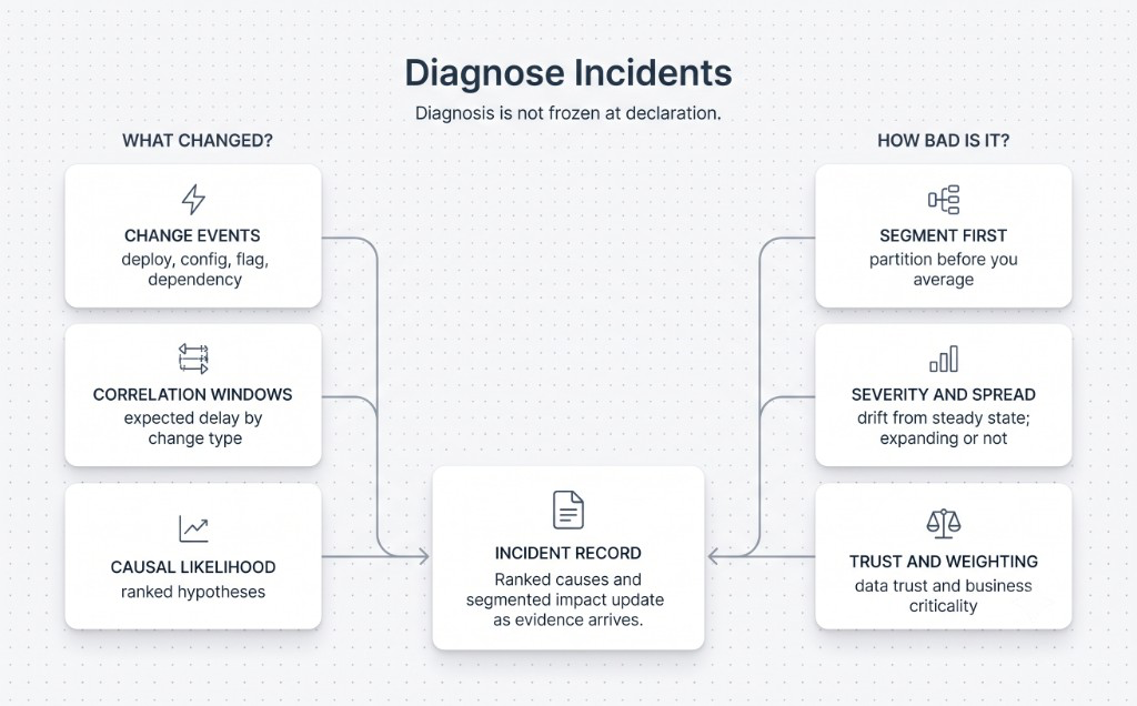
What changed?
Change events
A change is more than a deployment: config updates, feature flag flips, dependency shifts, and infrastructure mutations all count. Each one needs a timestamp, an owner, a scope (which regions, what fraction of the fleet), and whether it's reversible. Without that structure, there's nothing to reason over, only logs to search by hand.
Correlation windows
Proximity in time is not causation. A hard crash might follow a rollout within seconds. A telemetry degradation might lag by minutes. A systemic load effect can take longer still. Each change type gets its own expected delay window, so mismatched timelines get discarded early.
Causal likelihood
Once a change lines up in time and scope, it gets scored, not declared. The score weighs timing match, population overlap with the change's scope, whether similar changes caused similar failures before, and how many competing explanations remain. The output is a ranked list of hypotheses that keeps recalculating as new evidence arrives.
How bad is it?
Segment before you average
A single global number hides the incidents that matter most. Partition the affected population first: by region, rollout cohort, device type, user role, or service tier, whichever fits the failure. Otherwise a small failing cohort gets averaged away by a large healthy one.
Severity relative to steady state
Severity is how far behavior has drifted from the band you declared acceptable, not how bad a raw metric looks. Error budget consumption, availability burn rate, and heartbeat loss measure distance from that steady state, not distance from zero.
Rate of spread
Whether impact is stable, expanding, or accelerating changes the response it deserves, even at the same severity. A cohort degraded and flat for an hour is a different problem than one that doubled in the last five minutes.
Measurement trust
Degraded telemetry can make impact look smaller or larger than it is. Trust in the data is part of the score, not an asterisk on it.
Business weighting
The same raw severity means different things depending on the business criticality of the affected population, whether the component is a shared dependency, and whether exposure is external or internal.
Next: with the cause and impact known, the next question is what to do about it. See Recommend response.
Back to the self-healing incidents overview.