Built-in widgets
These widgets are available in the Custom section of the widget picker. Use them to embed content, trigger workflows and actions, review past runs, show markdown, chat with an AI agent, or surface quick links.
IFrame
You can create an IFrame widget to display an embedded URL in the dashboard. Use it for external dashboards or other external content. Port also appends the entity identifier and the blueprint identifier to the iframe URL as query params so the embedded page can use them.
The entity identifier is concatenated under the entity query param and the blueprint identifier under the blueprint query param. For example: https://some-iframe-url.com?entity=entity_identifier&blueprint=blueprint_identifier.
Note that the iframe request is made directly from the end user's browser, not from Port's backend.
If you are implementing IP whitelisting at the network or firewall level, you will need to account for the IP addresses of the users accessing the embedded dashboard - not the IP of Port itself.

URL type
When configuring an IFrame widget, you can specify whether the URL is public or protected.
For the protected URL type, you can configure how the OAuth authentication flow is handled using the Popup Authentication toggle:
- Toggle off (default): The OAuth login flow runs inside the IFrame.
- Toggle on: The OAuth login flow opens in a separate pop-up window.
If the Authentication URL points to Microsoft Entra ID (https://login.microsoftonline.com), the toggle is automatically turned on, since Entra ID login pages include security headers that prevent them from being displayed inside an IFrame.
Make sure your application allows CORS requests from the Port app origin for the authentication flow to work correctly:
- For the EU region, add
https://app.port.ioto your allowed origins. - For the US region, add
https://app.us.port.ioto your allowed origins.
If you enable the pop-up option, ensure your browser allows pop-ups for the Port app's domain. If pop-ups are blocked at the browser level, the authentication window will not open and the IFrame widget will fail to load.
Widget properties
| Field | Type | Description | Default | Required |
|---|---|---|---|---|
Title | String | IFrame widget title. | null | true |
Description | String | IFrame widget description. | null | false |
Icon | String | IFrame widget icon. | null | false |
URL | String | IFrame widget URL. | null | true |
URL Type | String | public or protected. | public | true |
Popup Authentication | Boolean | Shown when URL Type is protected. When on, the OAuth login flow opens in a pop-up window instead of inside the IFrame. | false | false |
Authentication URL | URL String | Required when URL Type is protected. See authentication code flow (PKCE). | null | true |
Token URL | URL String | Required when URL Type is protected. See authentication code flow (PKCE). | null | true |
Client Id | String | Required when URL Type is protected. See authentication code flow (PKCE). | null | true |
Scopes | String Array | Required when URL Type is protected. See authentication code flow (PKCE). | null | true |
Template variables
You can use template variables in your IFrame widget URL to dynamically construct links based on user or entity information. This is useful for creating dynamic IFrame URLs that adapt to the current context.
User information
In every dashboard, you can access user information using the {{ .user... }} template syntax. Available user properties include:
{{ .user.name }}.{{ .user.email }}.{{ .user.fullName }}.{{ .user.firstName }}.{{ .user.lastName }}.
Entity information
On specific entity pages, you can also access entity information using template variables. Available properties depend on the entity's specific properties. For example, if an entity has a title property, you can access it using {{ .entity.title }}.
Example use case
You can create an IFrame widget that links to external resources based on entity properties. For example, you can create an IFrame widget that links to a Grafana dashboard filtered by the entity's title:
https://grafana.example.com?var-service={{ .entity.title }}
Exploring available properties
To see what properties are available, you can print the whole object in your IFrame URL. For example, use {{ .user }} to see all available user properties, or {{ .entity }} to see all available entity properties on entity pages.
Template expressions require spaces inside the delimiters: a space after {{ and a space before }}.
Make sure to use {{ .user... }}, and not {{.user...}}.
Workflow card
This widget allows you to execute one or more workflow self-service triggers directly from any dashboard (including your homepage and entity pages).
A single workflow card can contain one or multiple workflows:
- Single workflow
- Multiple workflows
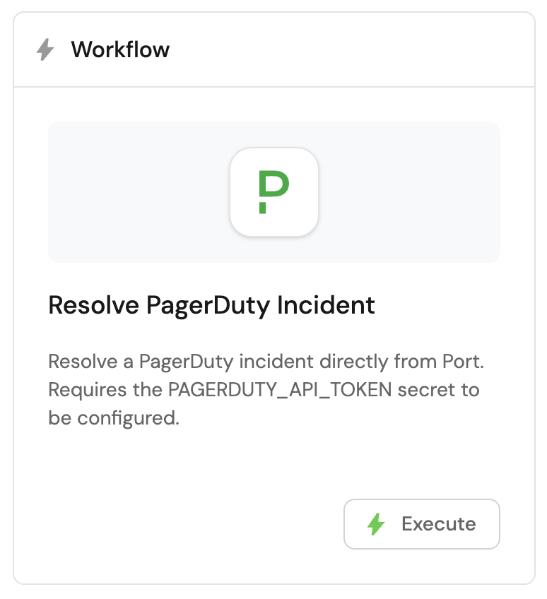
When you select one workflow, the form only asks you to pick that workflow and save. Port sets the widget title, icon, and description automatically. The card shows the workflow's own title and description, with an Execute button:
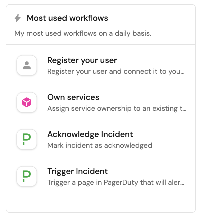
When you select more than one workflow, the form also asks for a Title (required), Icon, and Description for the widget. Each workflow appears as a row with its own title, description, icon, and execution button:
The widget respects both the trigger's execution permissions and the _workflows blueprint permissions, so users only see and run the triggers they are allowed to.
On entity pages, when a trigger has a matching entity user input, the current entity is prefilled automatically using the page context.
Widget properties
| Field | Type | Description | Default | Required |
|---|---|---|---|---|
Workflows | Array | The workflows (and optional self-service trigger) to display. Each item contains a workflowIdentifier and an optional triggerIdentifier. At least one workflow is required. | null | true |
Title | String | Workflow card widget title. Shown and required when you select more than one workflow. For a single workflow, Port sets the title to Workflow automatically. | null | false |
Icon | String | Workflow card widget icon. Shown when you select more than one workflow. For a single workflow, Port sets the icon automatically. | null | false |
Description | String | Workflow card widget description. Shown when you select more than one workflow. For a single workflow, Port clears the description. | null | false |
You can override the default title, description, icon, and button text for each trigger to tailor how it appears in the widget.
Action card
This widget allows you to execute self-service actions directly from any dashboard (including your homepage).
A single action card can contain one or multiple actions:
- Single action
- Multiple actions
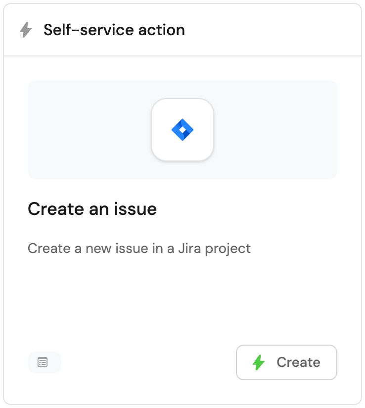
When you select one action, Port sets the widget title, icon, and description automatically. To execute the action, click the button in the bottom-right corner of the widget:
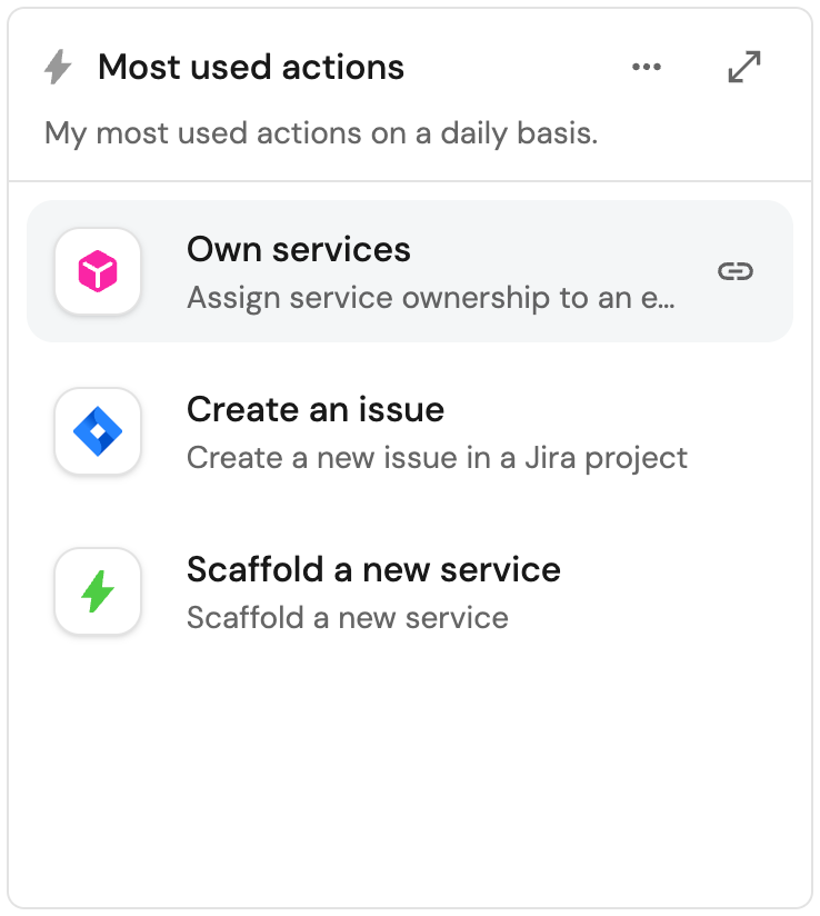
When you select more than one action, you choose your own title for the widget. To execute an action, click on one of them:
Widget properties
| Field | Type | Description | Default | Required |
|---|---|---|---|---|
Actions | Array | The self-service actions to display. Each item contains an action identifier. At least one action is required. | null | true |
Title | String | Action card widget title. Shown and required when you select more than one action. For a single action, Port sets the title automatically. | null | false |
Icon | String | Action card widget icon. Shown when you select more than one action. For a single action, Port sets the icon automatically. | null | false |
Description | String | Action card widget description. Shown when you select more than one action. For a single action, Port clears the description. | null | false |
Action history
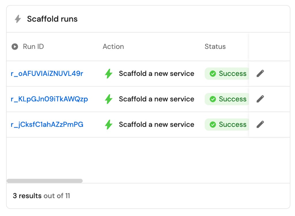
This widget allows you to create a table displaying all past runs of a self-service action in your portal.
The table will automatically display data about each run, including status, input parameters, the executing user, and more.
Widget properties
| Field | Type | Description | Default | Required |
|---|---|---|---|---|
Title | String | Action history widget title. | null | true |
Icon | String | Action history widget icon. | null | false |
Description | String | Action history widget description. | null | false |
Action | String | The self-service action whose runs to show. | null | true |
Markdown
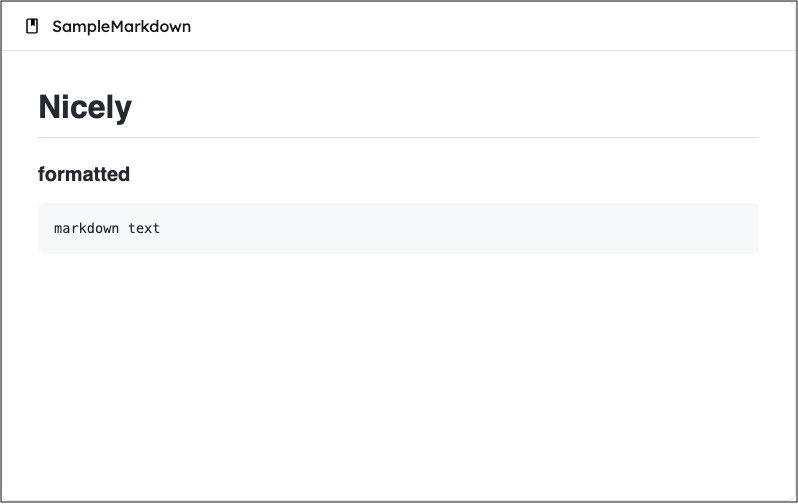
This widget allows you to display markdown content in formatted form. You can create custom markdown content or display markdown from an entity property.
Markdown content types
The markdown widget supports two data source types, selected via the data source field:
- Custom: create and edit markdown content directly in the widget configuration. When selecting this option, you will proceed to a second page where you can enter your custom markdown content. You can edit this content later by modifying the widget configuration.
- Property: display markdown content from a specific entity's markdown property. This is useful for entity-specific documentation, such as a service's README file. Users with edit permissions can modify the content directly within the widget, and Port will automatically sync the changes back to the entity's property.
- In specific entity pages: When using the property data source, only the property field is required. The blueprint and entity are automatically selected from the page context, so you don't need to specify them. There's no separate creation step since the markdown property already exists on the entity.
- In dashboards: When using the property data source, you must select the blueprint, entity, and property fields to specify which entity's markdown property to display.
Upload images
You can add images directly to your content while editing a markdown widget in Port.
Use any of the following methods to upload an image:
- Paste from clipboard: copy an image and paste it into the editor with
Cmd+V(macOS) orCtrl+V(Windows/Linux). - Drag & drop: drag an image file from your computer into the editor.
- Toolbar: click the image button in the editor toolbar to select a file to upload.
To insert an image hosted at an external URL, use Ctrl+K and provide the image URL.
Limitations:
- Maximum file size: 10MB per image.
- Maximum 50 uploaded images per widget.
- Supported formats are PNG, JPEG, GIF, WebP, APNG, and AVIF.
The widget also supports a wide variety of HTML tags, allowing you to create rich content:
Supported HTML tags (click to expand)
'iframe',
'a',
'style',
'h1',
'h2',
'h3',
'h4',
'h5',
'h6',
'nav',
'blockquote',
'dd',
'div',
'pre',
'dl',
'hr',
'li',
'menu',
'ol',
'p',
'ul',
'b',
'br',
'cite',
'code',
'em',
'i',
'mark',
'q',
's',
'samp',
'small',
'span',
'strong',
'sub',
'sup',
'time',
'u',
'var',
'wbr',
'img',
'video',
'caption',
'col',
'colgroup',
'table',
'tbody',
'td',
'tfoot',
'th',
'thead',
'tr'
Note: For external video URLs from providers such as YouTube, use the IFrame widget.
A practical example of using HTML in a markdown widget can be found in Port's live demo, in the Catalog quick access widget.
Markdown widget
| Field | Type | Description | Default | Required |
|---|---|---|---|---|
Title | String | Markdown widget title. | null | true |
Description | String | Markdown widget description. | null | false |
Icon | String | Markdown widget icon. | null | false |
Data source | String | The data source type for the markdown content. Possible values: Custom or Property. | null | true |
When Data source is Custom:
| Field | Type | Description | Default | Required |
|---|---|---|---|---|
markdown | String | Markdown content. Configured on a separate page after selecting Custom data source. | null | true |
When Data source is Property:
| Field | Type | Description | Default | Required |
|---|---|---|---|---|
Blueprint | String | The blueprint of the entity containing the markdown property. Required in dashboards. Not shown in specific entity pages (auto-selected from context). | null | false |
Entity | String | The entity containing the markdown property. Required in dashboards. Not shown in specific entity pages (auto-selected from context). | null | false |
Property | String | The entity's markdown property to display in the widget. Users with update permissions can edit the content directly through the widget. | null | true |
Links in markdown
When displaying markdown content in Port (especially content ingested from Git repositories or other external sources), relative links will not work. This is because the markdown is rendered in the context of your Port portal, not the original source location.
For example, links like [guide](./docs/guide.md) or [readme](../README.md) will not function correctly.
Solutions:
- Use absolute URLs instead:
[guide](https://github.com/your-org/your-repo/blob/main/docs/guide.md). - For links to other pages within your Port portal, use internal links (see below).
Internal Port portal links
When linking to other pages in your portal, you can use / as the URL base, instead of using full URLs.
For example, you can use <a href="/plan_my_day"> instead of <a href="https://demo.port.io/plan_my_day">.
Template variables
You can use template variables in your markdown widget content to dynamically display information about the current user or entity.
User information
In every dashboard, you can access the signed-in user using the {{ .user... }} template syntax. Commonly used built-in fields include:
{{ .user.name }}.{{ .user.email }}.{{ .user.fullName }}.{{ .user.firstName }}.{{ .user.lastName }}.
You can also reference custom user properties you add on the User blueprint (for example, fields you sync from your identity provider or maintain in the catalog). Use the same dotted path style as elsewhere in Port, for example {{ .user.properties.slack_url }} when your User blueprint defines a slack_url property. See Manage users & teams for how user entities and their properties work.
For example:
Welcome, {{ .user.firstName }}!
Entity information
On specific entity pages, you can also access entity information using template variables. The way you access properties depends on the property type:
- Built-in properties (identifier, title, team, etc.) are accessed directly:
{{ .entity.title }},{{ .entity.identifier }}. - Custom properties (user-added properties defined in the blueprint) are accessed via the
propertiesobject:{{ .entity.properties.custom_field }}.
Markdown from related entities
On entity pages, you can embed markdown that lives on a related entity. Port exposes that value on the current entity so you can reference it like any other property under {{ .entity.properties... }}. This lets you build richer, context-aware markdown (for example, pulling in a related service's readme next to fields on the current entity).
For example, if the markdown field's identifier is readme, use:
{{ .entity.properties.readme }}
Replace readme with the markdown property identifier from your blueprint.
Exploring available properties
To see what properties are available, you can print the whole object in your markdown widget. For example, use {{ .user }} to inspect the full user object (including custom properties), or {{ .entity }} to inspect the current entity and its relations on entity pages.
Template expressions require spaces inside the delimiters: a space after {{ and a space before }}.
Make sure to use {{ .user... }}, and not {{.user...}}.
AI agent
The AI agent widget embeds a chat interface for a specific AI agent directly in your dashboard, so users can ask questions and get assistance without leaving the page.
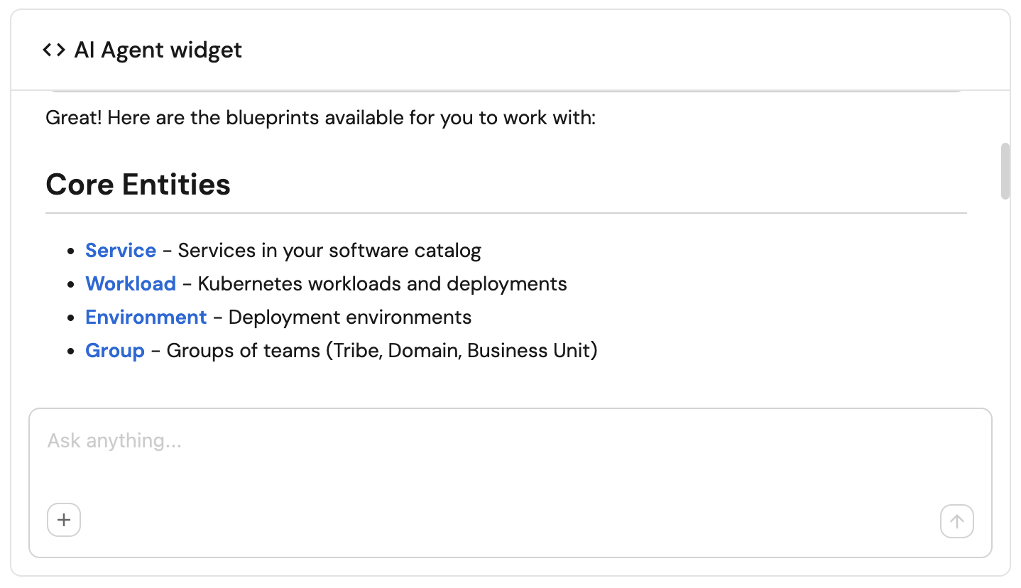
The widget inherits the selected agent's prompt, conversation starters, and tool access. Customize what the agent can help with, which tools it uses, and its conversation starters on the agent itself; configure the widget's title, icon, description, and which agent to show here.
Widget properties
| Field | Type | Description | Default | Required |
|---|---|---|---|---|
Title | String | AI agent widget title. | null | true |
Icon | String | AI agent widget icon. | null | false |
Description | String | AI agent widget description. | null | false |
Agent | String | The AI agent to display in the widget. | null | true |
To change what the agent can help with, its prompt, or its tools, see build agents. For widget setup steps, context-awareness behavior, and conversation starters, see the AI Chat Widget section of interacting with agents.
Links
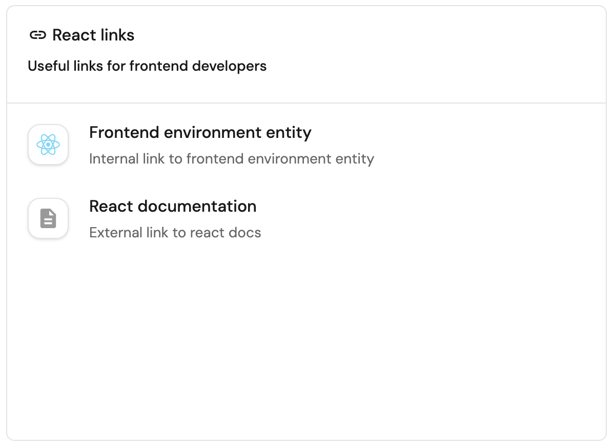
This widget allows you to display a list of links, both internal and external, for quick access to useful pages.
-
External links - links to external websites, such as documentation, 3rd party tools, etc.
These links will open in a new tab when clicked.
For example: "https://www.google.com". -
Internal links - links to internal pages in your portal, such as an entity page, a catalog page, an entity's audit log page, etc.
These links will open in the same tab when clicked.
For example: "https://app.port.io/serviceEntity?identifier=frontend". -
Dynamic links (available in specific entity page only) - links to external websites or internal pages while using the identifier of an entity.
These links will open according to the methods mentioned above.
For example: Let's take the following specific entity page/Services?identifier=myService.-
An external link:
https://slack.com/myOrganization/channel={{url.identifier}}-> translated intohttps://slack.com/myOrganization/channel=myService. -
An internal link:
https://app.port.io/PagerDutyService?identifier={{url.identifier}}-> translated intohttps://app.port.io/PagerDutyService?identifier=myService.
-
During creation/editing of the widget, you can sort the links by dragging and dropping them.
Widget properties
| Field | Type | Description | Default | Required |
|---|---|---|---|---|
Title | String | Links widget title. | null | true |
Icon | String | Links widget icon. | null | false |
Description | String | Links widget description. | null | false |
Links | Array | The links to display. At least one link is required. See fields below. | null | true |
Each link in Links:
| Field | Type | Description | Default | Required |
|---|---|---|---|---|
Title | String | Link title. | null | true |
Icon | String | Link icon. | null | false |
Description | String | Link description. | null | false |
Link | String | The URL to open when the link is clicked. | null | true |