Data widgets
Data widgets are visualization widgets that display data from your software catalog, including charts, tables, and entity information.
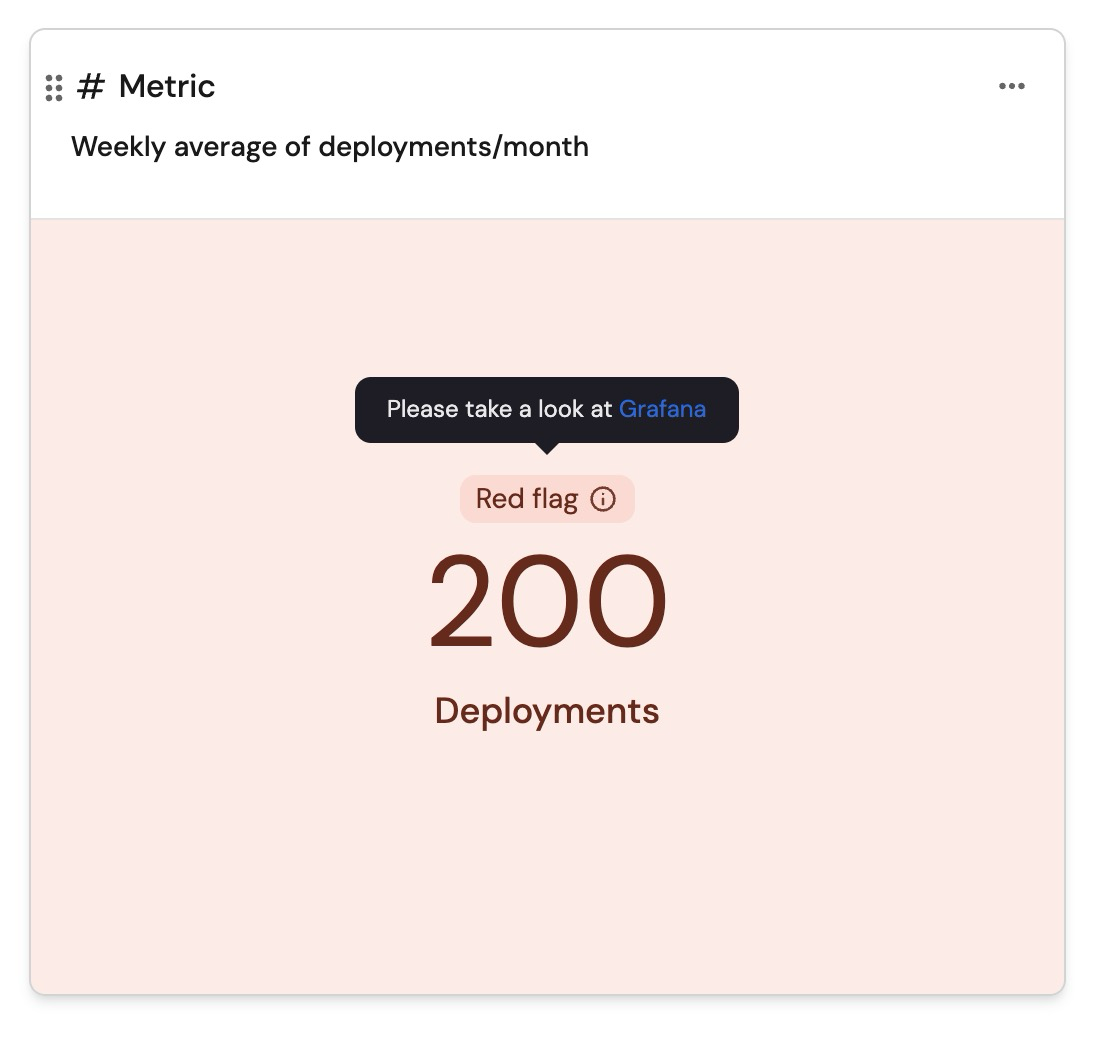
Number chart
Number charts display a number value related to an entity and its properties. Number charts support drill down.
You can choose one of these chart types:
- Display single property - display a property from a specific entity.
- Count entities - display the amount of related entities or show an average by time.
- Aggregate by property - apply an aggregation function on number properties from multiple entities.
You can also filter entities so the aggregation number chart will only apply to a limited set of entities with Port's Search Rules
Time filtering in number charts vs. line charts
The value shown in a number chart is calculated over all available entities of the selected blueprint. By default, it does not apply any time-based filtering.
When a number chart is used alongside a line chart in a dashboard, for example a number chart showing average monthly deployment frequency and a line chart showing deployment frequency over time, you might notice that the average values differ, even if both charts reference the same metric (e.g. deployment frequency).
This difference happens because the two charts are likely working with different time ranges:
- The number chart performs its calculation across all available historical entities, without limiting to a specific time range.
- The line chart, in contrast, only includes entities within its selected time range (e.g. the last 30 days).
To align both charts and ensure consistency in what they reflect, apply a time filter to the number chart that matches the line chart’s time range. This helps prevent confusion and ensures both charts are working with the same scope of data.
Display formatting
You can customize how numbers are displayed in number chart by selecting a formatting function:
-
None- displays the number without any formatting. -
Round- rounds the number to the nearest integer. -
Custom- allows you to specify decimal precision between one to five decimal places.
Conditional formatting
You can customize the appearance of a number chart based on specific conditions, helping viewers to quickly understand what the value indicates. When configuring a condition, you will need to provide the following:
-
Operator- select an operator from the available ones to define the condition. -
Value- enter the reference value to evaluate against the widget’s data. -
Color- choose the color the widget will display when the condition is met. -
Message- provide a short message to display above the number when the condition is met. -
Description- add a tooltip message that appears when clicking the label, offering additional context about the value's significance.
Suppose you define two conditions using the < operator:
< 8→ Green widget< 6→ Yellow widget If the number chart’s value is 5, both conditions (< 8and< 6) are technically true. However, since 5 is closer to 6 than to 8, the widget will be colored yellow - the color associated with the closest matching condition.
Properties
| Field | Type | Description | Default | Required |
|---|---|---|---|---|
Title | String | Number Chart title | null | true |
Icon | String | Number Chart Icon | null | false |
Description | String | Number Chart description | null | false |
Empty state text | String | Number chart empty state text | No data for this widget | false |
Chart type | String | Defines the operation type for the chart. Possible values: Display single property, Count entities, Aggregate by property | null | true |
Blueprint | String | The chosen blueprint from which related entities data is visualized from | null | true |
Display formatting | String | Defines how numbers are displayed. Possible values: None, Round, Custom (allows decimal precision between one to five decimal places) | null | false |
Condition | Object | Defines the condition under which the number chart widget will update its color, display a status label, and have a tooltip message | null | false |
Chart type: display single property
| Field | Type | Description | Default | Required |
|---|---|---|---|---|
Entity | String | The chosen entity from which property data is visualized from | null | true |
Property | String | The number property which will be visualized | null | true |
Unit | String | The unit of the number chart. Possible Values: %, $, £, €, none, custom | null | true |
Custom unit | String | Text to display below the number value. The unitCustom key is only available when unit equals to custom | null | true |
Unit alignment | String | left, right, bottom. | null | true |
Chart type: Count entities
| Field | Type | Description | Default | Required |
|---|---|---|---|---|
Function | String | count and average (by time). | null | true |
Average of | String | hour, day, week and month. | null | true |
Measure time by | String | Used to specify an alternative property to use as the time property for the average calculation instead of the default field which is createdAt. | createdAt | false |
Additional filters | Array | Filters to include or exclude specific data based on Port's search rules | [] | false |
Unit | String | The unit of the number chart. Possible Values: %, $, £, €, none, custom | null | true |
Custom unit | String | Text to display below the number value. The unitCustom key is only available when unit equals to custom | null | true |
Unit alignment | String | left, right, bottom. | null | true |
Chart type: Aggregate by property
| Field | Type | Description | Default | Required |
|---|---|---|---|---|
Property | String | The number chart value will be the selected property's aggregated value (according to the chosen function) | null | true |
Function | String | sum, min, max, average and median | null | true |
Average of | String | hour, day, week, month and total (divide the sum by the number of entities) | null | true |
Measure time by | String | Used to specify an alternative property to use as the time property for the average calculation instead of the default field which is createdAt. | createdAt | false |
Additional filters | Array | Filters to include or exclude specific data based on Port's search rules | [] | false |
Unit | String | The unit of the number chart. Possible Values: %, $, £, €, none, custom | null | true |
Custom unit | String | Text to display below the number value. The unitCustom key is only available when unit equals to custom | null | true |
Unit alignment | String | left, right, bottom. | null | true |
When performing calculations of average time intervals, such as by hour, day, week, or month, it is important to note that any partial interval is considered as a full interval. This approach ensures consistency across different time units.
For example, if the dataset includes information spanning across 2 hours and 20 minutes, but the selected average timeframe is hour, then the summed value will be divided by 3 hours.
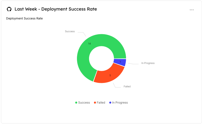
Pie chart
Pie charts illustrate data from entities in your software catalog divided by categories and entity properties. Pie charts support drill down.
Properties
| Field | Type | Description | Default | Required |
|---|---|---|---|---|
Title | String | Pie chart title | null | true |
Icon | String | Pie chart Icon | null | false |
Description | String | Pie chart description | null | false |
Empty state text | String | Pie chart empty state text | No data for this widget | false |
Blueprint | String | The chosen blueprint from which related entities data is visualized | null | true |
Breakdown by property | String | Group your chart by a specific property | null | true |
Additional filters | Array | Filters to include or exclude specific data based on Port's Search Rules | [] | false |
Visual styling
Pie chart colors are automatically assigned by Port based on the breakdown property values. Custom color selection, label formatting, and font styling are not currently supported.
Limitations
Pie charts can display up to 14 slices. If the breakdown contains more than 14 values, the remaining values are grouped into Other.
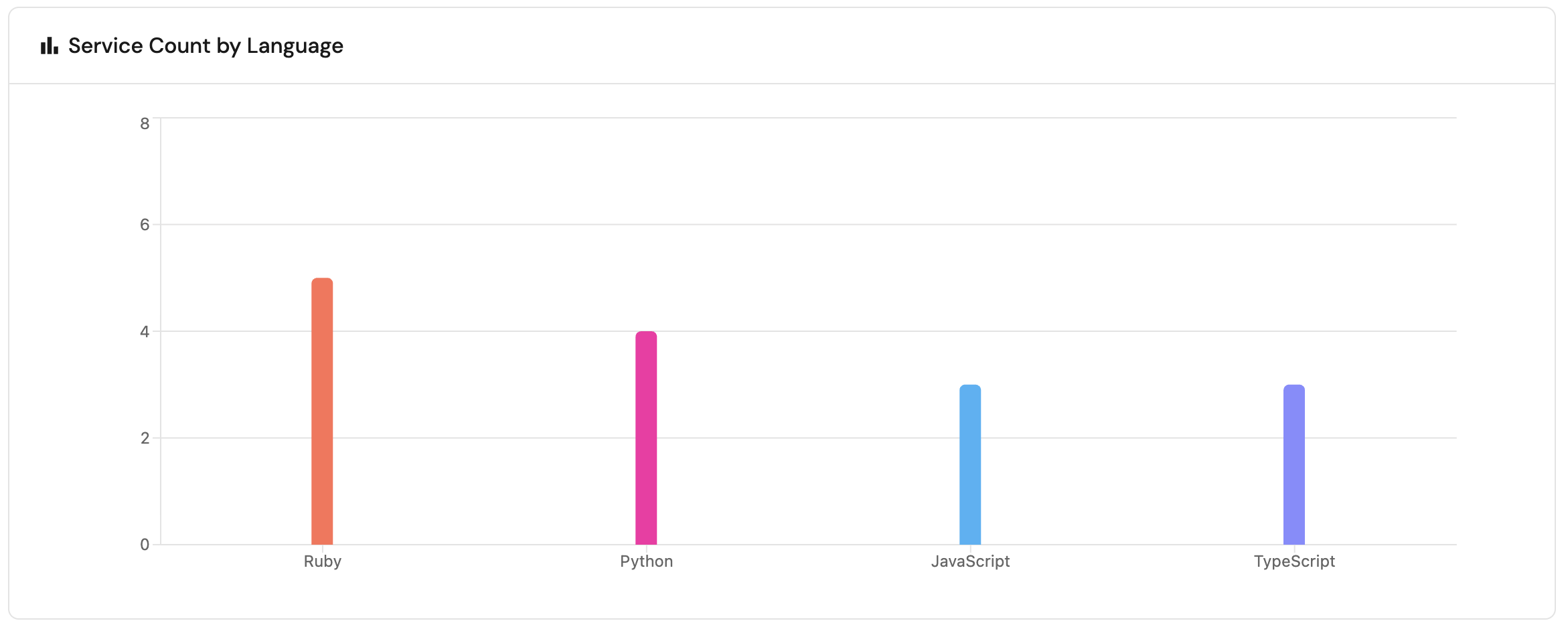
Bar chart
Bar charts illustrate data from entities in your software catalog divided by categories and entity properties, displayed as vertical bars. Bar charts support drill down.
Properties
| Field | Type | Description | Default | Required |
|---|---|---|---|---|
Title | String | Bar chart title | null | true |
Icon | String | Bar chart Icon | null | false |
Description | String | Bar chart description | null | false |
Empty state text | String | Bar chart empty state text | No data for this widget | false |
Blueprint | String | The chosen blueprint from which related entities data is visualized | null | true |
Breakdown by property | String | Group your chart by a specific property | null | true |
Additional filters | Array | Filters to include or exclude specific data based on Port's Search Rules | [] | false |
Visual styling
Bar chart colors are automatically assigned by Port based on the breakdown property values. Custom color selection, label formatting, and font styling are not currently supported.
Limitations
Bar charts are limited to displaying up to 9 bars. If there are more than 9 categories, the additional categories will be grouped into an "other" section.
Line chart
Starting March 10th, 2026, the line chart has been enhanced with new capabilities. Existing line charts remain fully functional, backward compatible, and can still be edited through the UI and API.
The new line chart offers greater flexibility by letting you combine multiple line chart types in a single widget. If you want to use these enhanced capabilities, you should create a new line chart. Note that in the API, the new line chart is named multi-line-chart.
If you manage dashboards using IaC tools (Terraform, Pulumi, etc.), note that the legacy line chart will be deprecated in mid-July 2026. We recommend migrating to the new line chart before then.
Line charts visualize trends over time, either by tracking number properties of entities or by tracking the entities themselves.
A single line chart widget can display multiple lines, allowing you to compare different metrics side by side.
Port offers three types of lines:
- Property history (single entity) - displays the values of one or more properties of a single entity.
- Aggregate property (all entities) - displays the aggregated values of one or more properties across all entities of a specific blueprint.
- Count entities (all entities) - displays either the total count of entities or the average number of entities from a specific blueprint over time.
Creating a line chart
To add a new line chart widget:
-
Configure the chart settings:
- Provide a title, icon, description, and optionally a custom empty state text for the widget.
-
Configure the X axis (shared across all lines):
- Give the axis a title.
- Select a time interval, which is the amount of time between each data point.
- Select a time range, which determines how far back the chart displays data (maximum 1 year).
-
Configure the Y axis title.
-
Add lines:
- Click
+ Lineto open the line configuration window. - Choose the chart type and configure its specific settings (see below for details on each type).
- Repeat to add multiple lines to the same chart.
- Click
-
Add baselines (optional): Add one or more baseline lines to compare your data against targets or benchmarks
- Click
+ Baselineto open the baseline configuration window. - Provide a name for the baseline.
- Choose a color.
- Set the target value (required).
- Click
-
Show null values as zero: Turn this on to display missing values as
0instead of leaving gaps in the line. (The tooltip for this values will shownullwhen the toggle is on)
Considerations:
- Shared Y axis: All lines in the chart share a single Y axis scale. When adding multiple lines, make sure you choose comparable metrics to ensure the chart remains meaningful and readable.
- Line colors: Even if a property value (such as an enum) has a defined color in Port (e.g., "Failed" → red), the line chart may not use the same color. Line colors may differ from property colors.
- Baselines: When using IaC tools, the baselines option is only available for
multi-line-chart. - Time filters: If a widget filter or dashboard time filter narrows the line's
Measure time byproperty beyond the chart's configured time range, the chart updates the displayed x-axis to match the narrowest range and may use a smaller interval to fit. When you clear the filters, the chart returns to its original configured range and interval. (Notice that it's not applied to property-history line type)
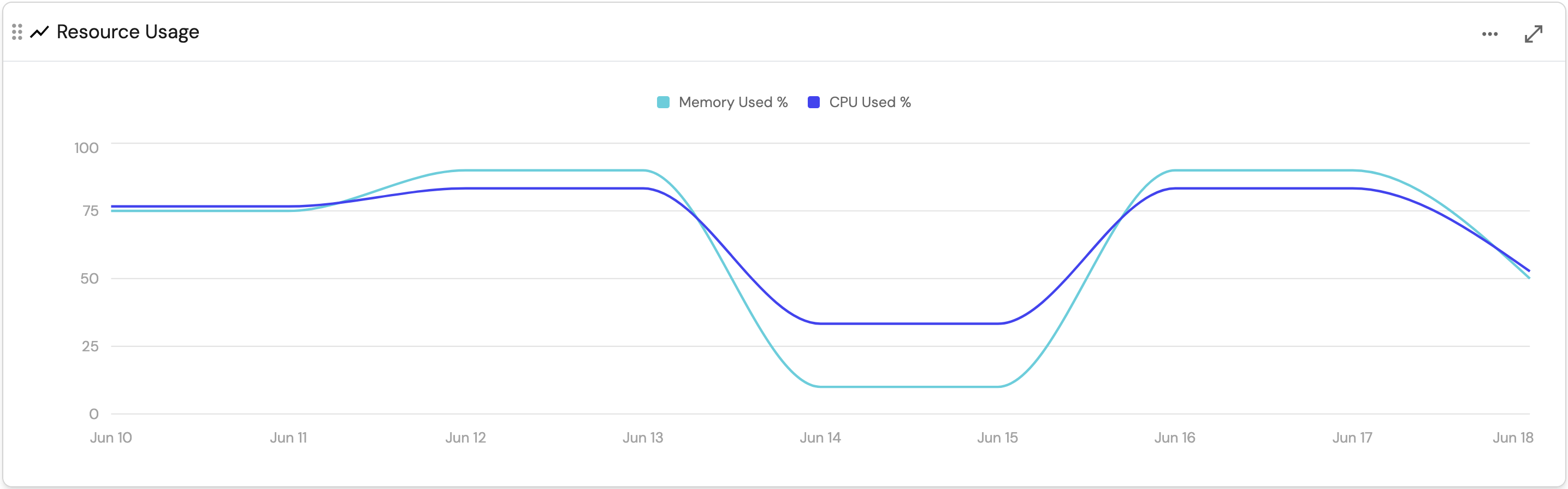
Property history (single entity)
This chart type displays the values of one or more properties of a single entity over time.
It reflects the state of the catalog at the chosen time. Past values are not recalculated if entities are later changed or deleted. This includes calculation and aggregation properties, which are stored as they were computed at that time.
Unlike other chart types, this chart preserves past values, while others always reflect the current state of the catalog and recalculate when data changes.
When creating this line type:
-
Give the line a title.
-
Choose the chart type:
Property history. -
Choose the blueprint you want to visualize.
-
Choose the entity you want to visualize.
-
Select one or more of the entity's
numberproperties to visualize.
When creating a line chart in an entity page, the chosen entity will be the entity whose page you are on.
For example, here is a line chart displaying a service's resource usage over the span of a week, in daily intervals:
Limitations
- This chart type displays data starting from the time the property was created on the blueprint.
Note that for aggregation (and calculation) properties, the data will be available from the time the aggregation property was created, and not the properties it is aggregating. - Line chart data is limited to the last 365 days.
Aggregate property (all entities)
This chart type displays the aggregated values of one or more properties across all entities of a specific blueprint.
Each property will be displayed as a separate line in the chart.
This chart type reflects the current state of the catalog and recalculate when data changes.
When creating this line type:
-
Give the line a title.
-
Choose the chart type:
Aggregate property. -
Choose the blueprint you want to visualize.
-
Choose one or more of the blueprint's
numberproperties to visualize. -
Choose an aggregation function, which is the operation to apply to the selected properties across all entities, for each time interval.
The possible values are:average: The average value of each selected property.median: The median value of each selected property.sum: The sum of values in each selected property.max: The maximum value of each selected property.min: The minimum value of each selected property.last: The last value of each selected property.
-
Optionally, define additional filters to include/exclude specific entities from the chart.
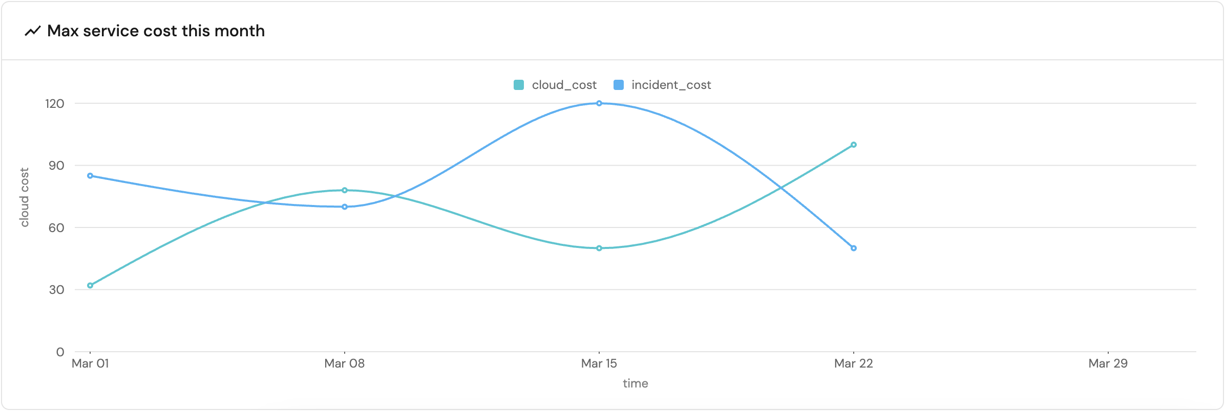
For example, here is a line chart displaying the maximum cost of all services over the span of a month, in weekly intervals:
Limitations
- Line chart data is limited to the last 365 days.
Count entities (all entities)
This chart type displays either the total count of entities or the average number of entities from a specific blueprint over time.
If you choose to break down the chart by a property, each line will represent a distinct value of that property.
This chart type reflects the current state of the catalog and recalculate when data changes.
When creating this line type:
-
Give the line a title.
-
Choose the chart type:
Count entities. -
Choose the blueprint you want to visualize.
-
Choose one of the following functions:
count: Counts the number of entities in each time interval.average: Calculates the average number of entities in each time interval.
The selected time interval determines how the function is calculated.
For example, if the time interval is a week:- The
countfunction will count the total entities that week. - The
averagefunction will count the total entities that week and divide it by 7.
The same logic applies to all time intervals:
Hour,Day,Week,MonthandQuarter-
when using theaveragefunction, the total entity count will be divided by: 60, 24, 7, 30 and 90 respectively. -
Optionally, break down the chart by a specific breakdown property, generating a separate line for each distinct value of that property.
-
Optionally, define additional filters to include/exclude specific entities from the chart.
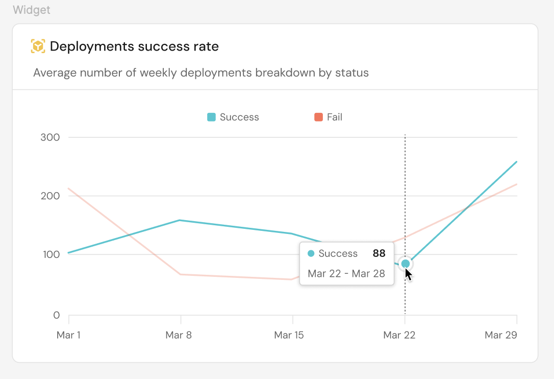
For example, here is a line chart displaying the average deployment rate over the span of a month, in weekly intervals, broken down by the status property (Success and Fail).
Limitations
- Line chart data is limited to the last 365 days.
- The chart can display up to 10 separate lines when choosing to break down by property.
Migration example
The following example demonstrates migrating a countEntities line chart (line-chart) to the new multi-line chart (multi-line-chart) format. The same migration pattern applies to all other chart types.
The widget JSON is passed as a string in the widgets field of the port_page Terraform resource, the port.Page Pulumi resource, and their equivalents in the API.
Before: line chart - count entities (click to expand)
{
  "id": "lineWidget",
  "type": "line-chart",
  "title": "Microservices on line chart",
  "description": "Example for line chart",
  "icon": "LineChart",
  "timeInterval": "hour",
  "timeRange": {
    "preset": "today"
  },
  "xAxisTitle": "X axis",
  "yAxisTitle": "Y axis",
  "blueprint": "microservice",
  "chartType": "countEntities",
  "func": "count",
  "measureTimeBy": "$createdAt",
  "dataset": {
    "combinator": "and",
    "rules": [
      {
        "operator": "=",
        "value": "microservice",
        "property": "$blueprint"
      }
    ]
  }
}
After: multi-line chart - count entities (click to expand)
{
  "id": "lineWidget",
  "type": "multi-line-chart",
  "title": "Microservices on line chart",
  "description": "Example for line chart",
  "icon": "LineChart",
  "timeInterval": "hour",
  "timeRange": {
    "preset": "today"
  },
  "xAxisTitle": "X axis",
  "yAxisTitle": "Y axis",
  "lines": [
    {
      "chartType": "countEntities",
      "title": "Line for count entities",
      "blueprint": "microservice",
      "func": "count",
      "measureTimeBy": "$createdAt",
      "dataset": {
        "combinator": "and",
        "rules": [
          {
            "operator": "=",
            "value": "microservice",
            "property": "$blueprint"
          }
        ]
      }
    }
  ]
}
The key differences when migrating to the new format are:
- The
typechanges fromline-charttomulti-line-chart. - The top-level widget fields (
id,title,description,icon,timeInterval,timeRange,xAxisTitle,yAxisTitle) remain unchanged. - The chart-specific fields move into a
linesarray, where each object represents a single line.
Each line requires atitle,blueprint, andchartType, plus the following fields depending on the chart type:propertiesValueHistory-entity,properties.aggregatePropertiesValues-func,properties,measureTimeBy,dataset.countEntities-func,measureTimeBy,dataset,breakdownProperty.
Table
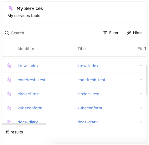
This widget allows you to create tables displaying all entities based on a selected blueprint.
Tables can be searched, filtered and customized as you wish, using the corresponding buttons in the widget.
By default, a new table will display the following columns for each entity:
Title, Last update time, and Creation time.
Other properties will be hidden by default.
You can always customize the table to hide/show columns.
Save table view
When you customize a table by filtering, sorting, or hiding columns, the changes will be automatically saved for you in the browser's local storage. If you log out and log back in, the table will display the same view you left it in.
Additionally, any such change will cause a Save view button to appear in the top right corner of the table:
Using this button, you can save the new view for all users in your organization.
The revert(↺) button next to it will revert the table to the last saved view.
The ability to save a view for all users is available only for the Admin role.
Customization
Just like catalog pages, tables support the following customization options:
Limitations
- Tables are limited to displaying up to 100,000 entities.
All UI table operations such as searching, filtering, grouping, etc. will be limited only to the entities that are displayed in the table.
If one of your blueprints has more than 100,000 entities, you can use the initial filters to narrow down the entities displayed in the table.
Entity card
This widget displays information about a specific entity, including its properties and scorecard compliance.
Simply choose a blueprint and a specific entity, and the widget will display information similar to that found on the entity's page.
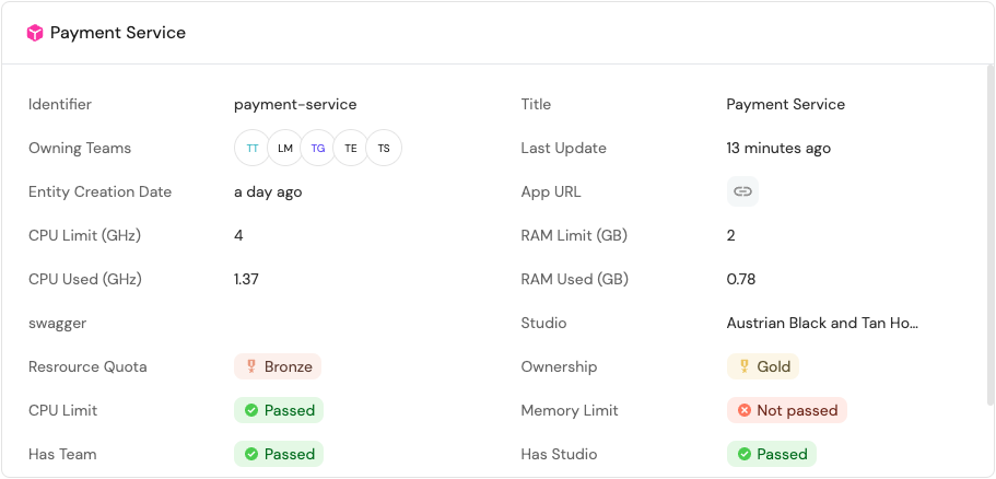
Chart drill down
Drill down lets you select a segment in a chart to view the individual entities that comprise that data point.
The following widgets support drill down:
- Pie chart - click a slice to view its entities.
- Bar chart - click a bar to view its entities.
- Number chart - click the number to view all entities that contribute to the displayed value.
For pie and bar charts, hover over a segment to see the percentage it represents of the total. For example, in a chart showing programming languages used by services, clicking the JavaScript slice (or bar) shows all services where the language is JavaScript.
In this entity view, you can:
- Add filters to further refine the displayed entities.
- Group entities by other properties.
- Customize the table (for example, columns and sorting).
Saving drill down views
The entity view opened from drill down can be saved. The saving behavior works the same as described in the save table view section.
Limitations
Drill down is not available when the breakdown property is a relation, scorecard, or scorecard rule. In these cases, clicking an element will open an empty view.
Custom empty state
The custom empty state field gives you the ability to define a custom message that appears when a widget has no data. This message can provide useful context to users such as setup instructions, relevant explanations, or helpful links.
The custom message supports Markdown formatting, so you can include links and other rich text elements. These will be rendered directly in the widget, making your guidance more actionable.
If you leave this field blank, the widget will display a default message: "No data for this widget".
The following widget types support the custom empty state message:
Chart filters
Chart filters allow you to limit which entities are included in your dashboard visualizations, making your charts more relevant and performant.
Pie charts, number charts and tables support filters, which allow you to include or exclude specific data from them. The filters are based on Port's Search Rules, and are set when creating the widget:
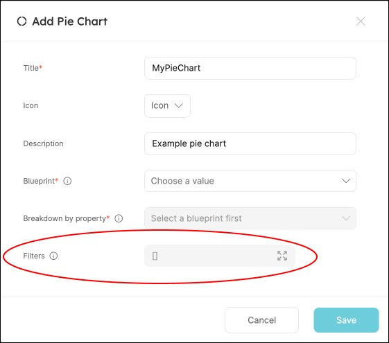
If you want to add additional filters, you can do so in the UI, or in the following manner:
Filter rules example (click to expand)
{
  "combinator": "and",
  "rules": [
    {
      "combinator": "or",
      "rules": [
        {
          "operator": "=",
          "value": "value1",
          "property": "property1"
        },
        {
          "operator": "=",
          "value": "value2",
          "property": "property2"
        }
      ]
    }
  ]
}
Filter example: only deployment entities from the last week
Let's assume we have a blueprint that is called Service which is related to another blueprint called Deployment, and we want to create visualizations on top of the last week's deployments of this service.
To achieve this desired state, we can go into one of the Service's profile pages and create a new visualization. After selecting the Deployment blueprint in the dropdown, we can add the following filter to the Filters array:
[
  {
    "property": "$createdAt",
    "operator": "between",
    "value": {
      "preset": "lastWeek"
    }
  }
]
Dynamic filters
You can use dynamic properties of the logged-in user when filtering a widget.
Widget type identifiers (Terraform)
When creating widgets using Port's Terraform provider, you need to provide the widget type's identifier in the type key.
The following table lists the identifiers for each data widget type:
| Widget type | Identifier |
|---|---|
| Number chart | entities-number-chart |
| Pie chart | entities-pie-chart |
| Bar chart | bar-chart |
| Line chart | line-chart |
| New line chart | multi-line-chart |
| Table | table-entities-explorer |